@starting-style という、主にアニメーションやトランジションの開始時の状態を設定するのに役立つ機能がすべてのブラウザにサポートされた模様
@starting-style の使用例
   .fade-in {
     opacity: 1;
     transition: opacity 1s;
   }

   @starting-style {
     .fade-in {
       opacity: 0;
     }
   }
これは.fade-inのclassがある要素はアニメーション開始時、opacity: 0という設定
この機能のいいところは、要素がdisplay: noneで非表示になっている要素にも初期スタイルを定義することができるところ
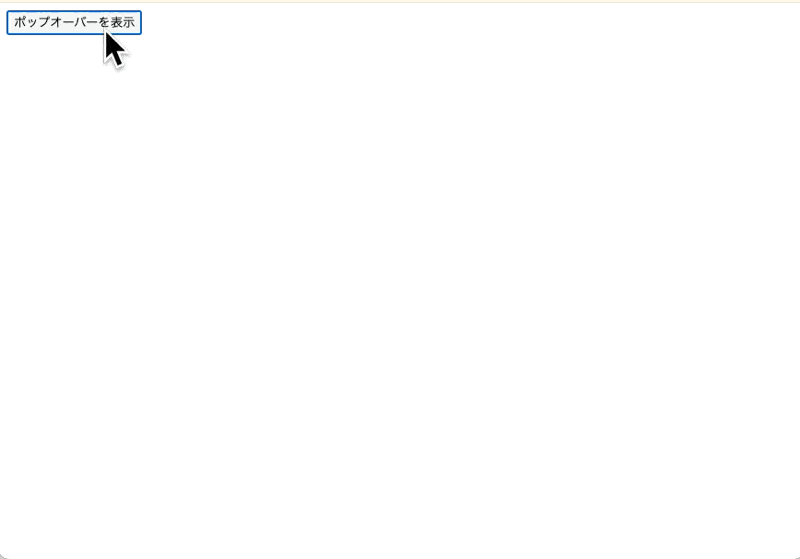
たとえば、以下のコードはmdnのページにあるものだが、クリックしたらpopoverが表示される
<!DOCTYPE html>
<html lang="en">
<head>
  <meta charset="UTF-8">
  <title></title>
  <style>
html {
  font-family: Arial, Helvetica, sans-serif;
}

[popover]:popover-open {
  opacity: 1;
  transform: scaleX(1);
}

[popover] {
  font-size: 1.2rem;
  padding: 10px;

  /* 消滅アニメーションの最終状態 */
  opacity: 0;
  transform: scaleX(0);

  transition:
    opacity 0.7s,
    transform 0.7s,
    overlay 0.7s allow-discrete,
    display 0.7s allow-discrete;
}

/* [popover]:popover-open ルールの後に入れる */
@starting-style {
  [popover]:popover-open {
    opacity: 0;
    transform: scaleX(0);
  }
}

/* ポップオーバーの背後のトランジション */
[popover]::backdrop {
  background-color: rgb(0 0 0 / 0%);
  transition:
    display 0.7s allow-discrete,
    overlay 0.7s allow-discrete,
    background-color 0.7s;
}

[popover]:popover-open::backdrop {
  background-color: rgb(0 0 0 / 25%);
}

@starting-style {
  [popover]:popover-open::backdrop {
    background-color: rgb(0 0 0 / 0%);
  }
}

  </style>
</head>
<body>
  <button popovertarget="mypopover">ポップオーバーを表示</button>
  <div popover="auto" id="mypopover">これがポップオーバーです。アニメーションします。</div>
</body>
</html>
@starting-styleを使わない場合は、JavaScriptか@keyframesを使ってアニメーションしていたのでより便利になった